The property
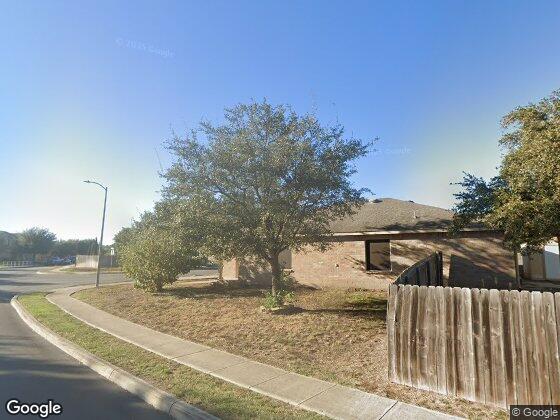
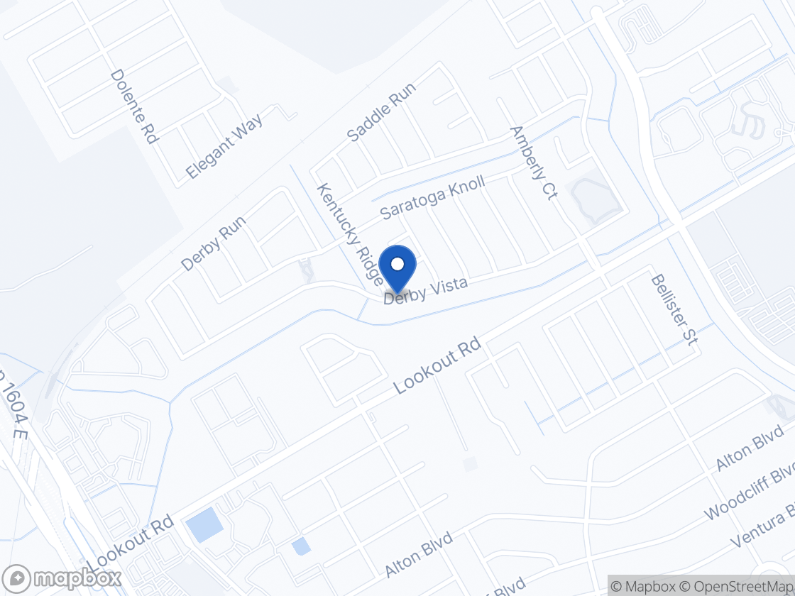
| Bedrooms | 3 |
|---|---|
| Bathrooms | 2 |
| Size | 1,500 – 1,800 sq ft |
| Condition | Well maintained |
| Listed with | Off-street parking, central air, private outdoor space |
The Selma, TX rental market
Three-bedroom detached rents in Selma and the 78154 side of Schertz are clustering tightly around $1,700–$2,000, with larger 2,000+ sq ft homes reaching the mid-$2,000s only at four bedrooms. Supply is substantial for a small city: roughly 20+ houses and many townhomes are listed at once in the ZIP, and several are 10–27 days on market. Concessions are present — one nearby townhome advertises half off the first full month and another offers a free TV on an 18-month lease — which means posted asking rents overstate effective rents by roughly 4% on those units and pricing above the cluster midpoint will likely sit. Townhomes and duplex units in the $1,200–$1,450 band compete at the bottom of the market and cap what plain 3-bed houses can ask.
What is driving it
- Randolph AFB and JBSA-Fort Sam Houston generate steady military and contractor lease demand
- I-35 and Loop 1604 access puts north San Antonio employment within a 20–25 minute commute
- The Forum at Olympia Parkway retail corridor and Retama Park are immediate local employers
- Northeast Lakeview College draws staff and student household demand
- Continued new-build subdivision and townhome supply in Selma and Schertz adds competing rentals
This area, from the Census
| Median gross rent | $1,714 |
|---|---|
| Renter households | 53% |
| Median year built | 2010 |
| Rent burden | 25% of household income |
| Median gross rent, 2019 → 2023 | $1,344 · $1,388 · $1,448 · $1,636 · $1,714 |
Five-year American Community Survey estimates for this census tract. Consecutive releases share four years of data, so the series is smoothed and lags by a year or two. The vacancy rate is not published for this tract.
Market rate analysis
Most likely rent
$1,800 / month
Supported range $1,700 – $1,900 · Confidence: high
Every comparable I used sits within half a mile of you, all inside the same street network with no highway between them, so this is unusually direct evidence. The same-bedroom set runs $1,695 at 16214 Example Vista (1,513 sq ft, 0.2 mi), $1,699 at 16102 Dummy Draw (0.3 mi), $1,775 at 7723 Sample Stable (1,672 sq ft, 0.3 mi), $1,800 at 7815 Notional Trot (1,608 sq ft, 0.1 mi), $1,850 at 16610 Fiction Trail (1,608 sq ft, 0.4 mi) and $1,995 at 7810 Notional Trot (2,390 sq ft with a half bath, 0.1 mi). The middle of that set is about $1,790. Your home matches these on bedroom and bath count and condition, and if you are at the upper end of your 1,500–1,800 sq ft band that is worth only about 2–3% over the 1,600 sq ft comps, since rent tracks bedroom count far more than floor area.
Comparable rentals
| # | Address | Dist. | Bd/Ba | Sq ft | $/ft² | Rent |
|---|---|---|---|---|---|---|
| 1 | 7815 Notional Trot | 0.1 mi2 min drive | 3/2 | 1,608 | $1.12 | $1,800 |
| 2 | 7810 Notional Trot | 0.1 mi2 min drive | 3/2.5 | 2,390 | $0.83 | $1,995 |
| 3 | 16214 Example Vista | 0.2 mi2 min drive | 3/2 | 1,513 | $1.12 | $1,695 |
| 4 | 7723 Sample Stable | 0.3 mi3 min drive | 3/2 | 1,672 | $1.06 | $1,775 |
| 5 | 16102 Dummy Draw | 0.3 mi3 min drive | 3/? | — | — | $1,699 |
| 6 | 16610 Fiction Trail | 0.4 mi5 min drive | 3/2 | 1,608 | $1.15 | $1,850 |
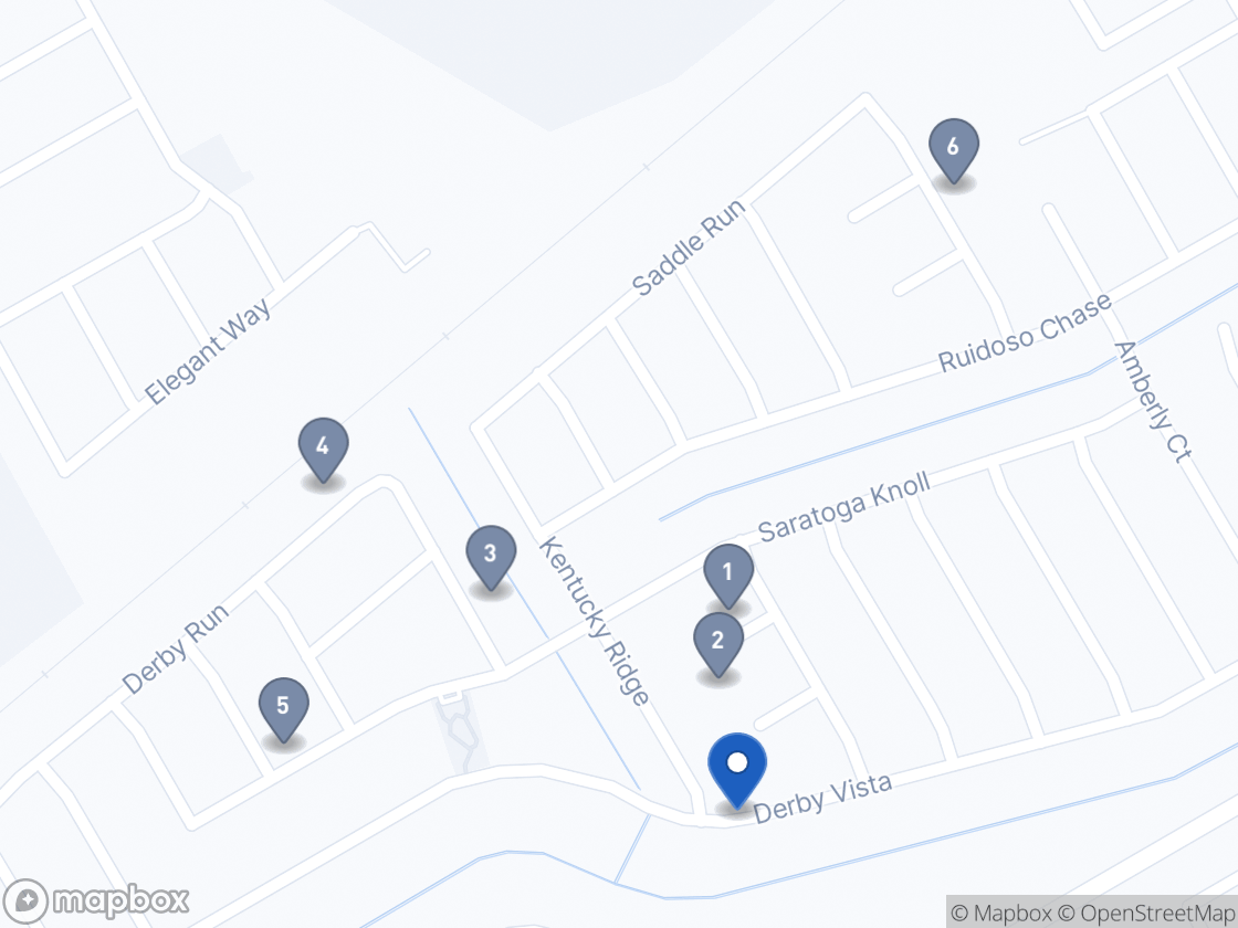
Numbers match the pins on the map. All six were placed.
How these were checked. These listings come from a live web search run when this report was built. Two figures are measured rather than taken from the listing: the distance, geocoded from each address, and the driving time, routed between the two points. Everything else — the asking rent, bedrooms, baths, floor area and whether the listing is still up — is as the listing presented it, and is not independently verified. Where the listing page itself could be identified, a source link is shown; no link means the search cited a results page rather than the property.
I found six active 3-bed listings within about a mile, including one on the adjacent street and two more inside the same subdivision, so no reach beyond the immediate neighborhood was needed. Several listings omitted square footage or bath count, and those are reported with dashes.
What is nearby
The closest of each category, chosen on measured travel time. Park distances are measured to the nearest edge.
Housing Choice Voucher
HUD's Fair Market Rent for a three-bedroom in the San Antonio-New Braunfels, TX HUD Metro FMR Area is $2,370 gross.
- That is a gross rent and includes utilities the tenant pays. The estimate above is contract rent, so the two are not read straight against each other.
- It is not the payment standard. The local public housing authority sets that between 90 and 110 percent of Fair Market Rent and then deducts a utility allowance, so the figure that governs a specific tenancy has to come from them.
- It is published on a lag. Here it sits above every live listing in the subdivision, all six of which ask between $1,695 and $1,995.
Your next move
- Finishing at 1,750–1,800 sq ft with a two-car garage supports $1,850–1,900
- Older kitchen finishes or carpet in the living areas would pull you toward $1,700–1,725, where comps 3 and 5 are priced
- A fenced yard plus covered patio is worth roughly $25–50 against comps without private outdoor space
- With five 3-bed houses asking under $1,900 within half a mile, pricing above $1,875 likely means extra weeks vacant
Timing
Listing volume here is heaviest from late spring through August, when military rotations and school-year moves overlap, and thinnest from November through January. Aim to have your 12-month lease end in May–July rather than mid-winter, when far fewer prospective tenants are searching.
Assumes a 12-month lease with the tenant paying their own utilities. An estimate based on current listings found for this area — not an appraisal, and not a substitute for seeing the unit. Check the comparable listings yourself before setting a rent.
Sources — Census Bureau American Community Survey. HUD Fair Market Rents. Maps: Mapbox, OpenStreetMap. Street imagery: Google.